Understanding Interfaces Used In Games
Understanding HCI
A computer mouse; touch screen; a program on your Mac or Windows machine that includes a trashcan; icons of disk drives; pull-down menus; steering wheels; pointing devices; motion detectors; headsets to name a few are all designed to make it easier to accomplish things with computers.
Human-Computer Interfaces is a
– Study, design, construction and implementation of human-centric interactive computer systems
A user interface (UI) is how a human interacts with a system
HCI includes
– Designing screens and menus that are easier to use
– Studies reasoning behind building specific functionality
– Long-term effects that systems will have on humans
HCI combines:
– Computer Science,
– Sociology and Anthropology - interactions between technology
human systems
– Ergonomics - safety, comfort of computer systems
– Psychology - the cognitive processes of humans and the behavior of
users
– Linguistics - development of human and machine languages
To outsiders, HCI provides recommendations for UI design
– Menus, icons, forms, data display and entry screens
{Christopher Wickens et al. defined 13 principles of display design in their book An Introduction to Human Factors Engineering}
Perceptual principles
1. Make displays legible (or audible). A display’s legibility is critical and necessary for designing a usable display. If the characters or objects being displayed cannot be discernible, then the operator cannot effectively make use of them.
2. Avoid absolute judgment limits. Do not ask the user to determine the level of a variable on the basis of a single sensory variable (e.g. color, size, loudness). These sensory variables can contain many possible levels.
3. Top-down processing. Signals are likely perceived and interpreted in accordance with what is expected based on a user’s past experience. If a signal is presented contrary to the user’s expectation, more physical evidence of that signal may need to be presented to assure that it is understood correctly.
4. Redundancy gain. If a signal is presented more than once, it is more likely that it will be understood correctly. This can be done by presenting the signal in alternative physical forms (e.g. color and shape, voice and print, etc.), as redundancy does not imply repetition. A traffic light is a good example of redundancy, as color and position are redundant.
5. Similarity causes confusion: Use discriminable elements. Signals that appear to be similar will likely be confused. The ratio of similar features to different features causes signals to be similar. For example, A423B9 is more similar to A423B8 than 92 is to 93. Unnecessary similar features should be removed and dissimilar features should be highlighted.
Mental model principles
6. Principle of pictorial realism. A display should look like the variable that it represents (e.g. high temperature on a thermometer shown as a higher vertical level). If there are multiple elements, they can be configured in a manner that looks like it would in the represented environment.
7. Principle of the moving part. Moving elements should move in a pattern and direction compatible with the user’s mental model of how it actually moves in the system. For example, the moving element on an altimeter should move upward with increasing altitude.
Principles based on attention
8. Minimizing information access cost. When the user’s attention is diverted from one location to another to access necessary information, there is a
n associated cost in time or effort. A display design should minimize this cost by allowing for frequently accessed sources to be located at the nearest possible position. However, adequate legibility should not be sacrificed to reduce this cost.
9. Proximity compatibility principle. Divided attention between two information sources may be necessary for the completion of one task. These sources must be mentally integrated and are defined to have close mental proximity. Information access costs should be low, which can be achieved in many ways (e.g. proximity, linkage by common colors, patterns, shapes, etc.). However, close display proximity can be harmful by causing too much clutter.
10. Principle of multiple resources. A user can more easily process information across different resources. For example, visual and auditory information can be presented simultaneously rather than presenting all visual or all auditory information.
Memory principles
11. Replace memory with visual information: knowledge in the world. A user should not need to retain important information solely in working memory or retrieve it from long-term memory. A menu, checklist, or another display can aid the user by easing the use of their memory. However, the use of memory may sometimes benefit the user by eliminating the need to reference some type of knowledge in the world (e.g. an expert computer operator would rather use direct commands from memory than refer to a manual). The use of knowledge in a user’s head and knowledge in the world must be balanced for an effective design.
12. Principle of predictive aiding. Proactive actions are usually more effective than reactive actions. A display should attempt to eliminate resource-demanding cognitive tasks and replace them with simpler perceptual tasks to reduce the use of the user’s mental resources. This will allow the user to not only focus on current conditions, but also think about possible future conditions. An example of a predictive aid is a road sign displaying the distance from a certain destination.
13. Principle of consistency. Old habits from other displays will easily transfer to support processing of new displays if they are designed in a consistent manner. A user’s long-term memory will trigger actions that are expected to be appropriate. A design must accept this fact and utilize consistency among different displays.
Different HCI used in games
There are four methods of UI in games they are Diegetic; Non-diegetic; meta and spacial.
Meta UI
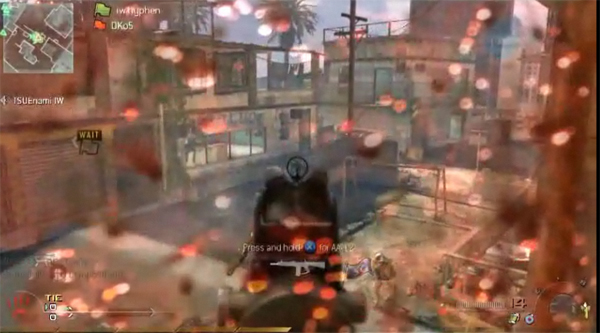
Call of Duty: Modern Warfare 2 - Sometimes UI elements don’t fit within the geometry of the game world. They can still maintain the game’s narrative but sit on the 2D hub plane — these are called Meta elements.
A common example of a Meta UI element is blood the splatters on the screen as a form of health bar, as in Call of Duty: Modern Warfare 2. Blood splashing on the screen within the 2D HUD plane to tell the player that the character is losing health)
Spacial UI
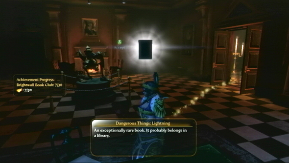
Fable 3 is an example where Spatial UI elements are used to provide more information to the player and save them the hassle of jumping to a map screen. The glowing trail fits well within the fiction given it’s magic aesthetic quality although it is just a guide for the players eyes only and the character isn't meant to be aware of it. The glowing trail guides the player to the next objective automatically without having to place points of interest on the map.
Fable 3 is an example where Spatial UI elements are used to provide more information to the player and save them the hassle of jumping to a map screen. The glowing trail fits well within the fiction given it’s magic aesthetic quality although it is just a guide for the players eyes only and the character isn't meant to be aware of it. The glowing trail guides the player to the next objective automatically without having to place points of interest on the map.
Non-Diegetic
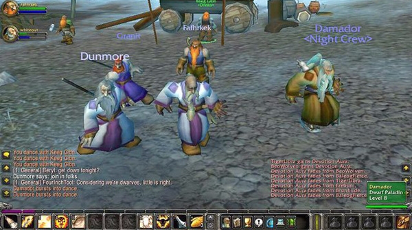
World of Warcraft uses mostly Non-diegetic UI, one exception being the Spatial player names. It allows the user to completely customize it, hopefully to ensure players a familiar experience. Most of the UI elements in World of Warcraft sit on the 2D hub plane, some elements sit within the world’s geometry such as the player names however the character isn’t aware of any of the UI.
World of Warcraft uses mostly Non-diegetic UI, one exception being the Spatial player names. It allows the user to completely customize it, hopefully to ensure players a familiar experience. Most of the UI elements in World of Warcraft sit on the 2D hub plane, some elements sit within the world’s geometry such as the player names however the character isn’t aware of any of the UI.
Diegetic
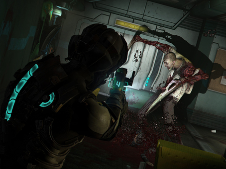
Dead Space
In Dead Space, instead of providing a typical health bar overlay, the player’s health is indicated by the high-tech meter on the avatar’s suit.
Having this diegesis applied to the game makes sure the players eyes are constantly on the action happening to or near the character.
Dead Space
In Dead Space, instead of providing a typical health bar overlay, the player’s health is indicated by the high-tech meter on the avatar’s suit.
Having this diegesis applied to the game makes sure the players eyes are constantly on the action happening to or near the character.